
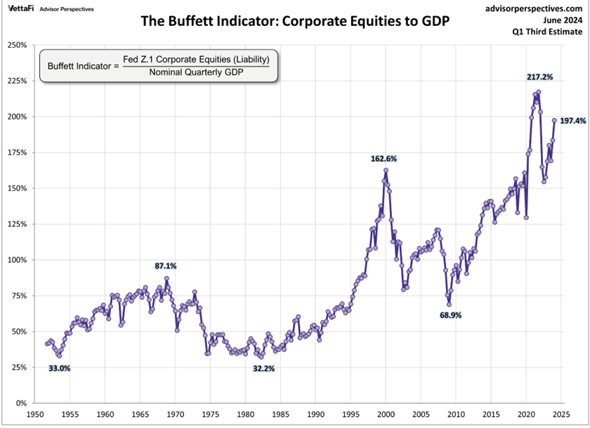
 Weekly Market Update by Retirement Lifestyle Advocates
The stock market rallied last week with the Dow Jones Industrial Average closing above 40,000 for the week; however, the economic outlook doesn’t seem to be congruent with a rising stock market. And, as I noted in the subscriber only “Positions” newsletter this week, the advance in stocks was on lower trading volume, a bearish divergence which can precede stock declines.
One of the best ways to measure market breadth is to look at the number of advancing stocks compared to the number of stocks that are declining; this technical indicator is known as the advance/decline line. Here is a short excerpt from an “MSN” piece published last week that explains (Source: https://www.msn.com/en-us/money/markets/stock-market-breadth-may-have-already-peaked-with-investors-sniffing-out-economic-weakness/ar-BB1pCGSu):
The S&P 500 on Monday scored its longest winning streak in nearly six months. And once again, the stocks leading the index higher were a select few of the largest technology companies in the world.
In a Monday note, Jonathan Krinsky, chief market technician at BTIG, observed that U.S. stock-market breadth over the past 12 months peaked around two months ago, with laggards likely reflecting investors’ worries over a potential economic slowdown.
The cumulative advance-decline line (A/D line) for the S&P 500 — a stock-market breadth indicator measuring the difference between the number of advancing and declining stocks — reached its highest level in early May, Krinsky wrote.
The A/D line trends upward when the number of advancing stocks exceeds the number of declining ones, and it falls when the number of declines exceeds the number of advances. An increasing A/D line indicates strong market breadth, while a declining line represents narrowing breadth in the stock market.
When a major stock index is rising and its A/D line is falling, it shows that fewer stocks are participating in a rally — which also suggests that the index could be nearing the end of its uptrend.
In 1990s, the S&P 500’s cumulative advance-decline line peaked in the spring of 1998, and that peak was followed by a 22% drawdown between July and October that year, Krinsky noted.
“So the breadth divergence did have a consequence for [stocks] in the medium term,” the strategist said, while noting the S&P 500 didn’t see its dot-com bubble peak for another two years.
To be sure, Krinsky doesn’t call for an exact repeat of the 1998 drawdown in the stock market. However, he thinks that divergences between the S&P 500’s winners and losers can last for a long time.
The 1998 decline came amid plummeting oil prices, an Asian economic crisis, a debt default by Russia and the blowup of Long-Term Capital Management.
The S&P 500’s A/D line has declined since May, even as the index has soared to multiple record highs over the past two months.
Does this mean the stock market is on the verge of a correction?
Not necessarily. The Fed seems to be poised to begin rate cuts again soon. The question is, should the Fed cut interest rates, will the market react as it has previously and rally?
Past radio guest Michael Oliver, founder of Momentum Structural Analysis, notes that there have been times historically that the Fed cut rates as stocks fell.
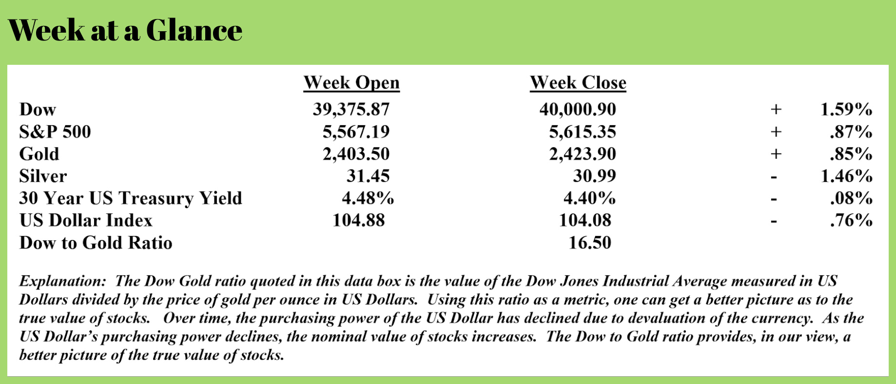
Given the lack of breadth in stocks and given the current level of “The Buffet Indicator,” a.k.a. market capitalization to gross domestic product, a rally in stocks when/if the Fed cuts rates is not a given.
Notice from the chart (Source: https://www.advisorperspectives.com/dshort/updates/2024/07/02/buffett-valuation-indicator-june-2024) that “The Buffet Indicator is once again approaching the 200% level. At the very least, these valuation levels have never been the starting point for a sustained stock market rally.
 As far as the economy goes, one of the most historically reliable, leading recession indicators is the U.S. Treasury yield curve. An inverted yield curve, with short-term treasury yields exceeding long-term yields, has been a consistent indicator of recessions.
More on this topic from “Schiff Gold” (Source: https://schiffgold.com/commentaries/the-yield-curve-christine-lagarde-agree-dont-expect-a-soft-landing/):
An inverted Treasury yield curve has historically been associated with economic downturns, preceding every recession since the late 1960s. Earlier this year, it set a new record for remaining inverted for more than 624 days, which was the 1978 record.
The curve has inched slightly back up but remains stubbornly inverted, and now even the Wizards of Global Finance themselves, like European Central Bank President Christine Lagarde, are warning against assuming a “soft landing” is anything but assured for the global economy. In fact, a crash is feeling more likely by the day.
The yield curve hasn’t remained this inverted since the Great Depression. Recessions reliably follow this trend, but pundits are saying that this time is different because it doesn’t signal a contraction in credit as it has in the past, and stocks have rallied since the inversion began. They also say that markets have become more aware of the yield curve and priced it in, reacting with cutbacks before the ‘real’ recession sets in and forces more pain.
With a massive wave of commercial mortgage loans set to mature between 2024-2025, and record numbers of empty office buildings in American cities with little hope of finding occupants, there are at least $1.2 trillion worth of reasons to be concerned.
It’s not just the U.S. either. The yield curve on Canadian bonds has been inverted as well, with persistent inflationary pressures remaining despite Canada’s central bank recently making the decision to cut rates. In the U.K., the yield curve just recently flattened after being inverted for over a year.
Long-time readers of “Portfolio Watch” know that it has always been my position that a ‘soft landing’ for the economy is highly unlikely. Debt levels in the private sector and on the balance sheet of the federal government are simply too massive to allow for that outcome.
The bottom line is this: if there is too much debt to be paid, it won’t be paid. That is ultimately deflationary like the economic climate that emerged during the 1930’s.
While I fully expect the Fed will continue to try to fend off the inevitable deflationary reset via more easy money policies, given the debt levels that exist they simply cannot be successful.
So, what does that mean?
Here’s my take. We will see stagflation in the shorter-term, a contracting economy combined with rising consumer prices and deflation longer-term.
As for stocks, it’s my strong view that they will once again synch up with the realities of the economy.
This week’s RLA radio program features an interview that I conducted with Mr. Michael Oliver, founder of Momentum Structural Analysis (mentioned above).
Michael and I discuss Federal Reserve policy and the future direction of stocks, US Treasuries, commodities, and precious metals.
The program is posted here on the RLA website. Click the "Podcast" tab at the top of this page to listen now. The weekly Headline Roundup newscast is also posted there. If you haven’t yet done so, check out all the free resources available here on the website.
“Far better is it to dare mighty things, to win glorious triumphs, even though checkered by failure….than to rank with those poor spirits who neither enjoy nor suffer much because they live in a gray twilight that knows not victory nor defeat.”
-Theodore Roosevelt

Comments