
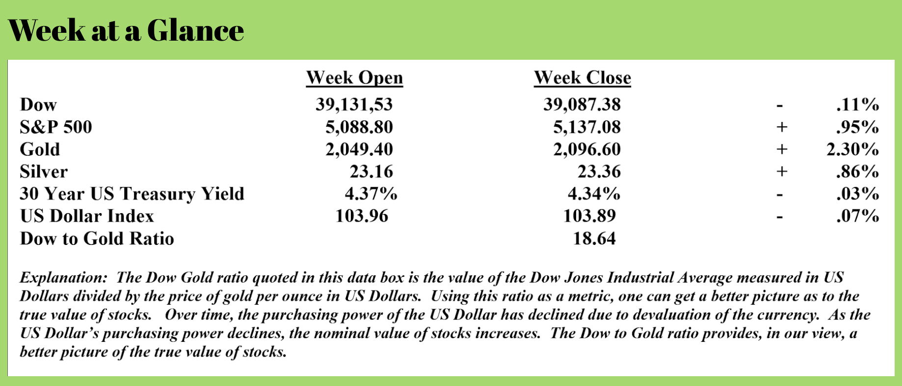
 Weekly Market Update by Retirement Lifestyle Advocates
Ever since the Fed began pumping out new currency and stocks and real estate values rose, I have not been shy about sharing my opinion that we are in an ‘everything bubble.’
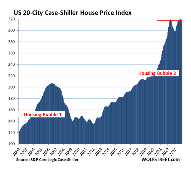 This past week, while preparing for my weekly “Headline Roundup” newscast, I read an article by Wolf Richter that contained a chart that perfectly illustrated what I believe is one component of this ‘everything bubble’ – housing. (Article Source: https://wolfstreet.com/2024/02/27/the-most-splendid-housing-bubbles-in-america-feb-2024-update-20-city-index-drops-for-2nd-month-from-double-top-biggest-price-drops-from-2022-peak-san-francisco-seattle-portland-denver-phoenix/)
Richter, using the Case-Shiller House Price Index, assembled a chart that illustrates just how inflated housing prices are.
Notice from the chart, which compares the housing bubble from the time of the financial crisis to the current bubble, how much more dramatic the price rise has been as the most recent bubble has inflated.
As I pointed out in my “Headline Roundup” newscast, using the 20-city Case Shiller House Price Index, housing prices increased from bottom to top by 71% at the time of the financial crisis. The bubble took about 5 years to build and about the same amount of time to unwind and bottom.
The current housing price bubble began to build in 2012 and took about 11 years to peak (assuming we are at a top, more on that momentarily). The price bubble inflated at about a 45 degree angle on the price chart above from 2012 to 2020 before the price pattern went parabolic, or nearly straight up.
When studying historic bubbles, one finds that they are often symmetrical when charted, taking about as much time to unwind as they take to build.
 Based on this price chart, I would make two observations. The first is that the price chart is showing a double top pattern, which is frequently a good indicator of a market turning point. The second observation I would make is that based on the price pattern, I would forecast a future decline in housing of 35% to perhaps as much as 50%.
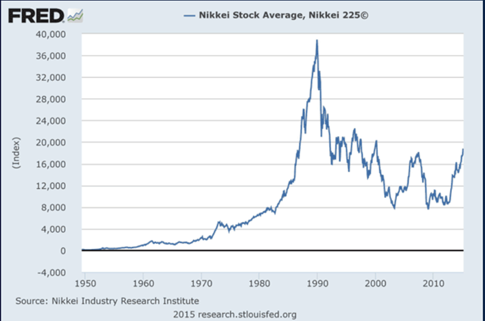
There are many historical price bubble charts to examine. Most support these observations.
This chart (above) is a chart of the major Japanese stock index, the Nikkei. The bubble that began to build in the early 1980’s peaked around 1990 and bottomed around calendar year 2000.
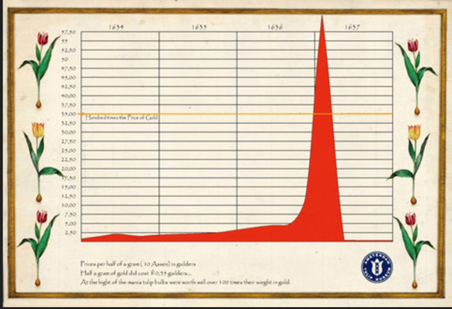 Another much older example is the tulip bulb mania that took place in the Netherlands in the 1600’s.
At the mania’s peak, tulip bulb speculators were paying the equivalent of a skilled worker’s annual salary for just one tulip bulb.
Like all bubbles eventually do, the tulip bulb bubble burst.
The chart reprinted (Left) is from the Amsterdam Tulip Museum is a textbook parabolic price bubble chart that took about as long to unwind as it did to build.
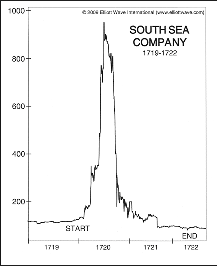 We see another example of this chart pattern looking at the price chart of the South Sea Company from 1719 to 1722.
Again, the price pattern on the chart is parabolic and the bubble took about as ling to unwind as it did to build.
While not all historical examples are as ‘textbook’ as these, the pattern is fairly predictable.
One can look at a stock chart from 1929 and see the pattern as well.
Notice from the chart, how symmetrical the price bubble is.
In the case of stocks in the 1920’s and 1930’s, the stock bubble began to build in about 1922, peaking in 1929 and hitting bottom in the early, to mid 1930’s.
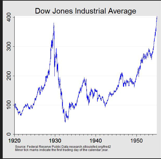 Notice in the case to the Dow during the time of The Great Depression, stocks didn’t get back to their 1929 peak until 1954 – about the length of time of one retirement.
That’s an important point – the length of time it takes a market to recover.
In the case of stocks, it took 25 years for prices to recover to their price prior to the decline.
In the case of the Nikkei market mentioned above, it took more than 30 years.
In the case of the South Sea bubble and the tulip price bubble, prices never recovered.
I expect a long recovery time for house prices, too.
Assuming house values experience an initial decline like the one that I believe will have to occur, price recovery will be hampered by the number of baby boomers looking to sell their homes.
Presently, according to a report recently released by Freddie Mac (Source: https://www.freddiemac.com/research/forecast/20240226-us-economy-defied-expectations#aging), baby boomers, those born between 1946 and 1964, make up 38% of total homeowner households.
The oldest of the boomers will turn 78 this year and many boomers will be looking to make decisions about their housing, choosing to downsize or to move into retirement communities.
Data shows that home ownership percentages increase through age 75 when the percentage of Americans who own homes begins to decline. Freddie Mac estimates that boomer home ownership will decrease by 30% by the year 2035, potentially hampering a price recovery should the bursting of the housing price bubble that I am forecasting occur.
This week’s radio program features an interview with Michael Pento, founder of Pento Portfolio Strategies and host of the popular podcast “The Mid-Week Reality Check.”
Mr. Pento provides his forecast for stocks, bonds and gold moving ahead and weighs in on the inflation followed by deflation debate.
Be sure to check out the interview now by clicking on the "Podcast" tab at the top of this page.
-Mick Jagger

Comments