
 Weekly Market Update by Retirement Lifestyle Advocates
About one week ago, I completed the June Special Report which is titled “Mid-Year Market Update: What to Consider Now for Your Money”.
This week’s holiday issue of “Portfolio Watch” is a preview of that Special Report.
As I have often stated, the potential problem with a time-sensitive special report written 3-4 weeks before delivery, is that so many things can change by the time the delivery happens.
The June Special Report examines the state of many markets and offers a forecast at to where they go from here.
Interestingly, the stock forecast offered seems to be playing out already. Here is a bit from that report which can be ordered next week for those with an interest in reading the entire report.
Last year, when we forecast a high probability of a stock market correction, we pointed to a commonly used piece of fundamental data, something known as “The Buffet Indicator”.
The Buffet Indicator is actually a measure of the total value of stocks as compared to economic output. Put another way, this indicator is a measure of market capitalization (the total, combined value of stocks) divided by Gross Domestic Product (total economic output).
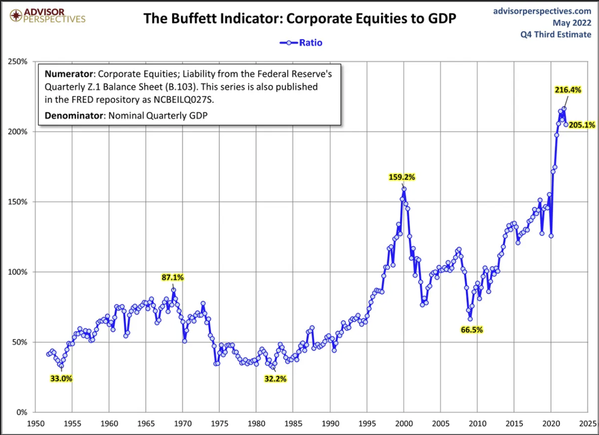
Last year, we published this chart, noting that the indicator showed that stocks were extremely overvalued.
There are three important points of reference on the chart. The first is the calendar year 2000 when the Market Cap to GDP indicator stood at 159.2%. That means that in approximate terms, the total value of stocks was about 1.6 times the economic output of the United States.
From those levels, stocks fell more than 50%.
The second important reference point is in 2007 when stocks peaked just prior to the financial crisis. At that point, stocks were valued at 110% of US economic output. From that point, stocks once again fell more than 50%!
Then, late last year, the Buffet Indicator rose to 216%, a level never seen previously. The total value of stocks was more than twice the total economic output of the United States. At those levels, it was easy to predict a stock decline was inevitable. As a side note, for stocks to return to the historic average of the Buffet Indicator, they would need to fall 70% from those lofty levels.
As of this writing, we have now seen about a 20% correction.
Technically speaking, as long-term readers of our newsletters and special reports know, we called the top in the market in December. While forecasting where stocks go is dangerous business in an artificial economy abundant with newly created currency, it seemed like a December 2021 top was likely for a couple of reasons.
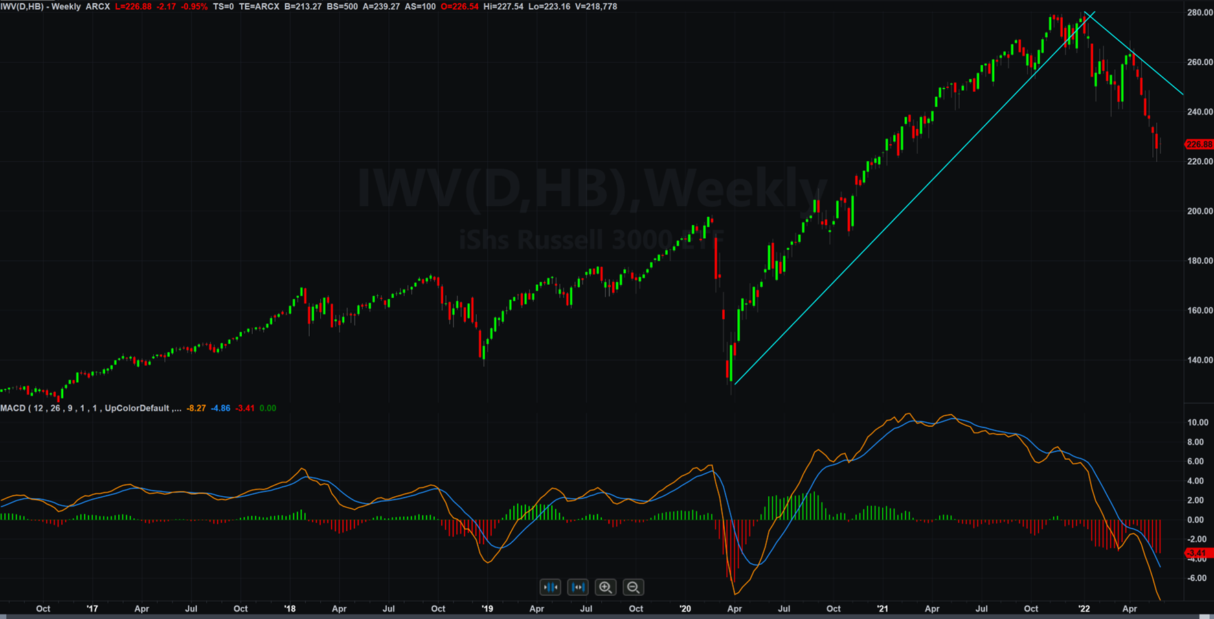
The chart above is a chart of an exchange-traded fund that tracks the movement of the Russell 3000, a broad stock market index
There is another technical indicator that we use to potentially detect major turning points in the market. While the indicator itself isn’t unique, the way that we use it is unique.
The indicator is something called a MACD, often pronounced, “mac – dee”. It is a technical indicator developed by Gerald Appel in the 1970s. MACD is an acronym that stands for moving average convergence-divergence.
The MACD is often used with a daily or a weekly chart to determine trend changes. The chart above is a weekly chart and the MACD indicator has been drawn across the bottom of the chart.
The MACD indicator has two lines moving up and down across the bottom of the chart. These lines, one orange and one blue occasionally cross each other. It is these crossovers that many traders use to trade and determine potential trend changes.
The orange line on the bottom of the chart is drawn by taking the 12-period moving average of price and subtracting the 26-period moving average of price. If you look closely at the labeling on the right-had side of the MACD indicator, you’ll see a zero line. When the orange line crosses the zero line, it is at that point that the 12-period moving average of price and the 26-period moving average of price are the same.
Here's what one can discern using a moving average of price: the 12-period moving average of price is the market’s consensus of value over the 12 periods. On the chart above, which is a weekly chart, the 12-period moving average of price is the market’s consensus of value over the past 12 weeks. The 26-period moving average is the market’s consensus of value over the past 26 weeks.
When the orange line on the chart above is over the zero line, it tells you that the 12-period moving average is higher than the 26-period moving average. That means that if the moving average of price over the past 12-periods is greater than the moving average of price over the past 26-periods, the market may be bullish.
The blue line on the chart is a 9-period average of the difference between the 12-period moving average and the 26-period moving average.
When the orange line on the MACD chart crosses over the blue line to the upside, it means that the trend may be turning positive or bullish. When the orange line crosses over the blue line to the downside, it means the trend may be turning negative or bearish.
This indicator, like any other indicator, is far from perfect. In a market that is not solidly trending, the MACD line and average line crossover can lead to false signals.
Notice also within the MACD indicator above, there are some vertical lines drawn. These vertical lines are known as a histogram. They plot the difference between the MACD line (the 12-period moving average line minus the 26-period moving average line) and the average line.
On a longer-term chart, like a monthly chart, the ‘ticks’ up or down of these lines can signal a strengthening or a weakening market.
Looking at the chart above, I’ve drawn a downtrend line on the chart. Notice how far the current price (as of one week ago) is from the down trend line drawn on the right-hand side of the chart. If this Exchange Traded Fund (IWV) doesn’t close over about $253 (from a present price as of this writing of $225), the trend will remain down.
That means that stocks could rally by up to 12% or so from here and not change the primary trend from down to up. Last week, stocks made up half that gap. I look for the trend line to hold and the downtrend to remain intact.
That means stocks can rally from here by another 5% or more without a trend change occurring.
This week’s radio program and podcast features an interview with Murray Gunn, analyst with Elliot Wave. I get Murray’s forecast for world markets and discuss the impact of social mood on markets. It’s a fascinating conversation you won’t want to miss this. You can listen now by clicking on the "Podcast" tab at the top of this page.
“It is the mark of an educated mind to be able to entertain a thought without accepting it.”
-Aristotle
